Magazeeen
Client
Magazeeen
Year
2018
Deliverables
Brand Identity, Publication, Digital Design
Industry
Art & Culture
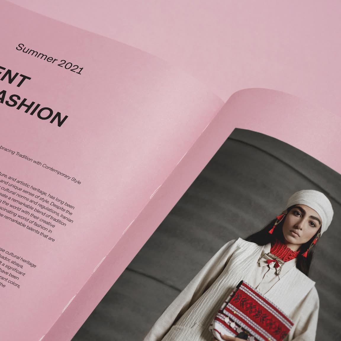
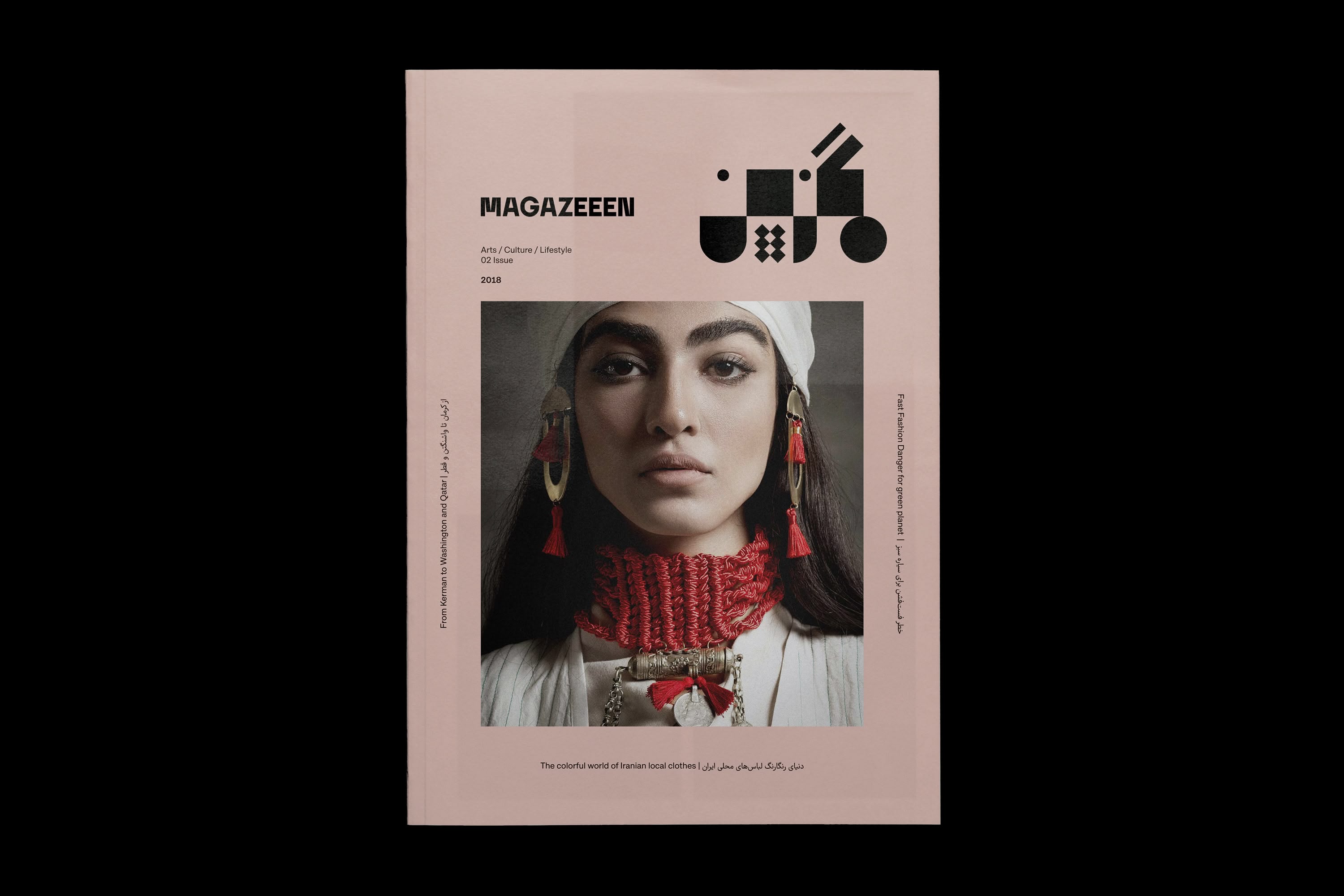
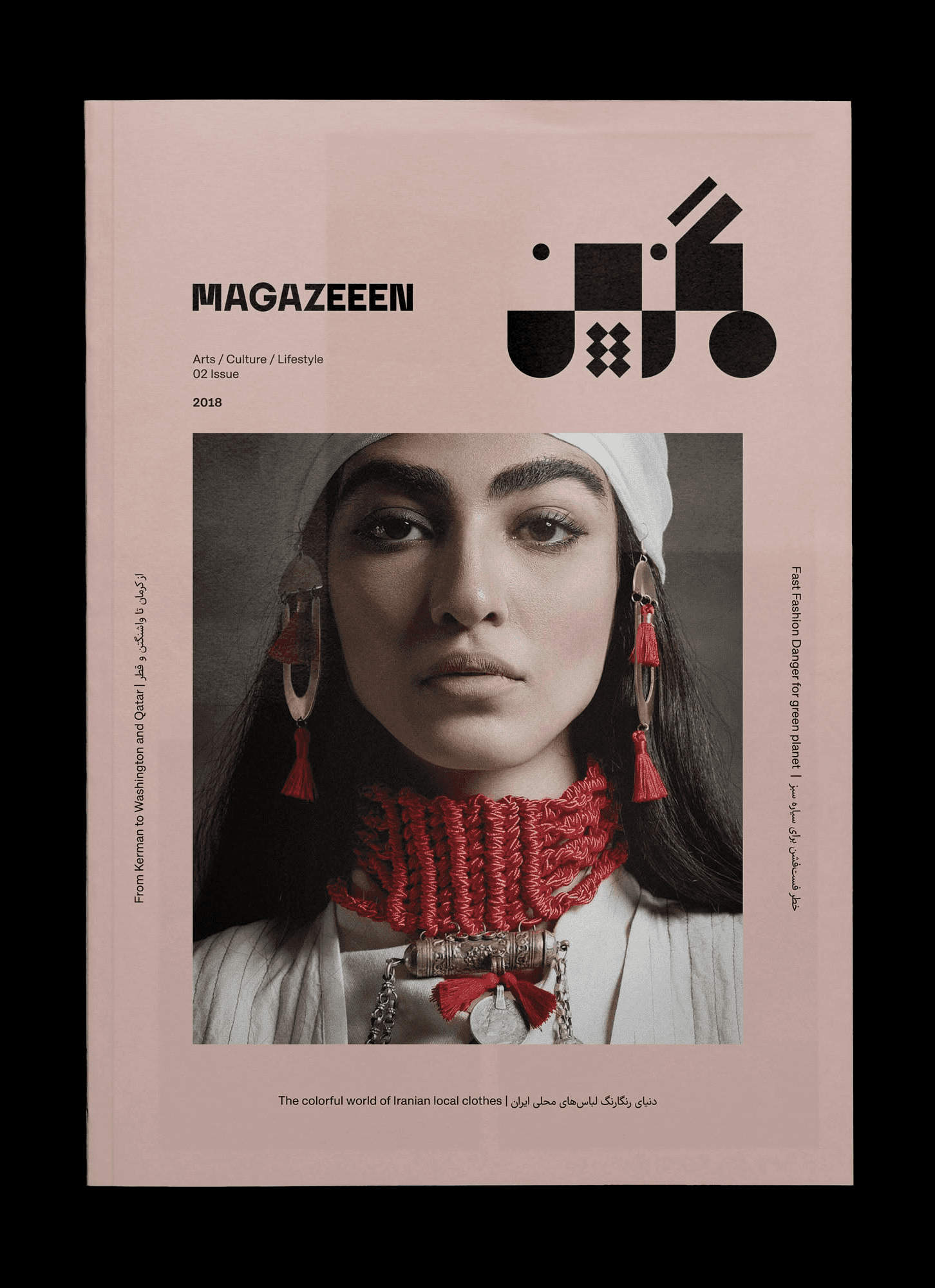
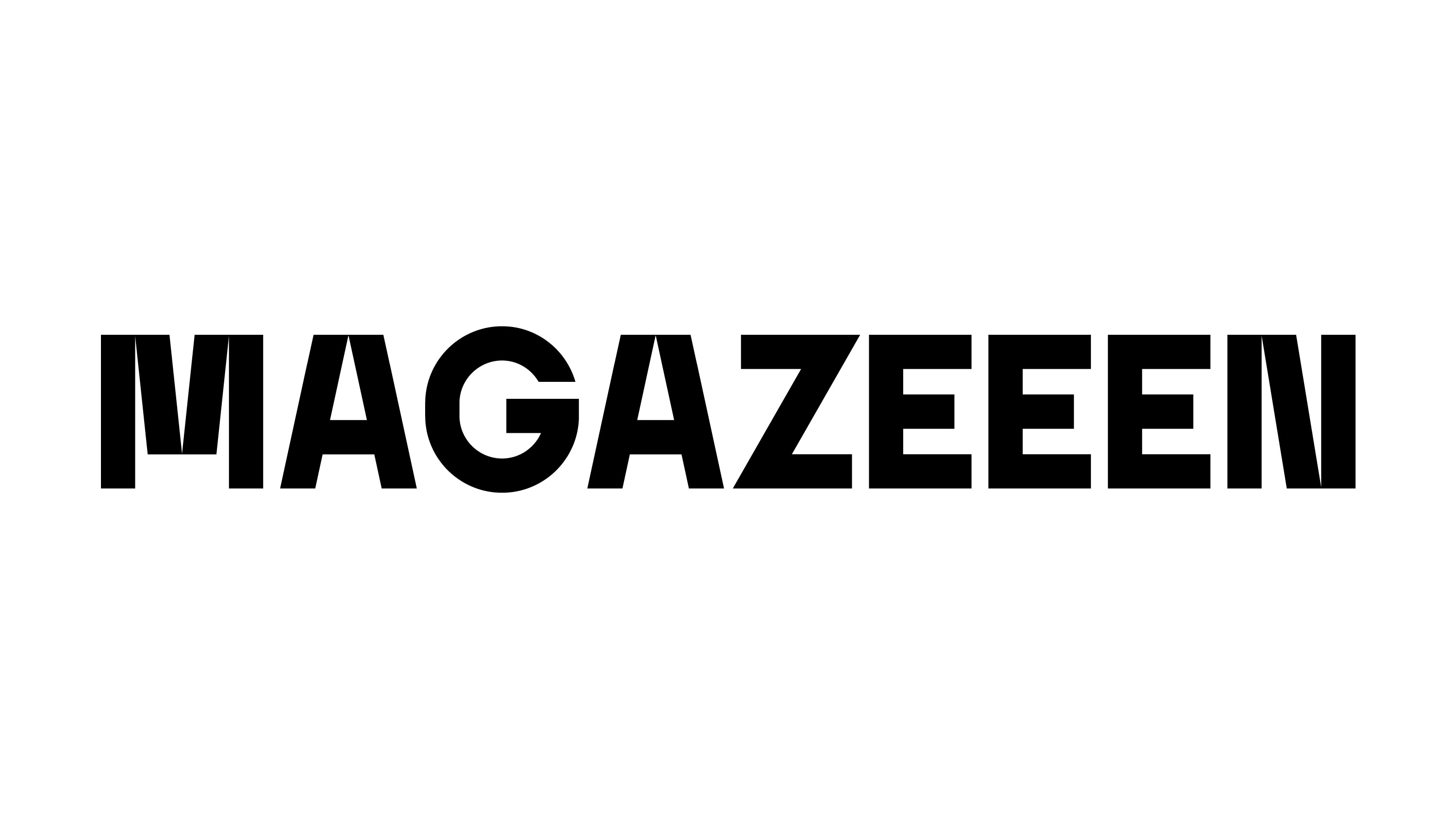
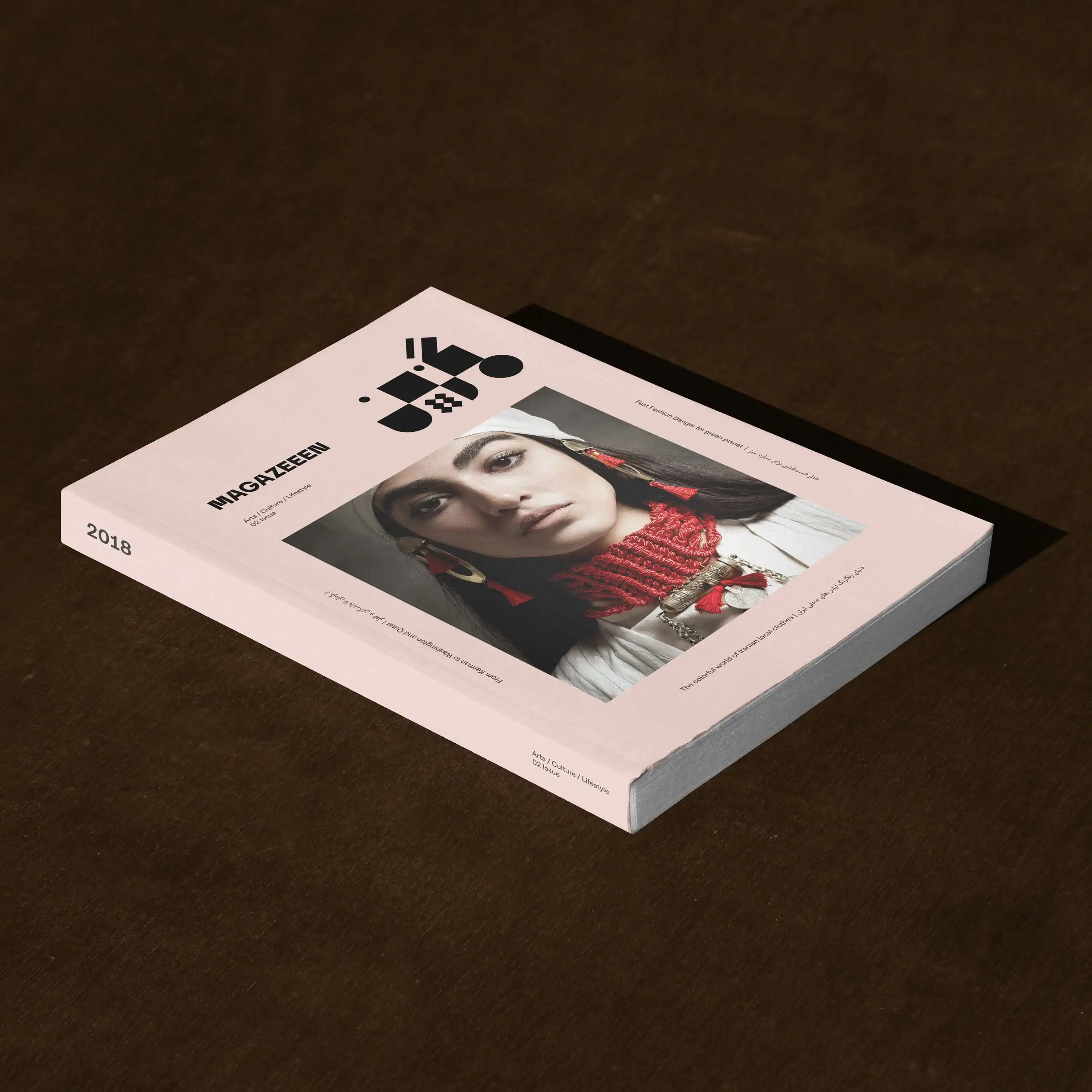
MAGAZEEEN, an independent art, design, and lifestyle magazine, delves into contemporary culture through a creative lens. Its visual identity is centered around a bilingual logotype designed in both English and Persian, reflecting the magazine’s cross-cultural narrative and its commitment to artistic dialogue.
The design approach draws inspiration from geometric abstraction, reducing form to its essential structure to emphasize clarity, rhythm, and proportion. Each typographic element was meticulously refined to establish a visual equilibrium between the two scripts, enabling them to coexist within a shared aesthetic language.
The resulting typographic system exudes precision and expressiveness, while simultaneously embodying timelessness and progressiveness. It encapsulates the editorial ethos of MAGAZEEEN: a platform for creative voices that prioritize experimentation, authenticity, and the pursuit of novel forms of expression.
Magazeeen
Client
Magazeeen
Year
2018
Deliverables
Brand Identity, Publication, Digital Design
Industry
Art & Culture
MAGAZEEEN, an independent art, design, and lifestyle magazine, delves into contemporary culture through a creative lens. Its visual identity is centered around a bilingual logotype designed in both English and Persian, reflecting the magazine’s cross-cultural narrative and its commitment to artistic dialogue.
The design approach draws inspiration from geometric abstraction, reducing form to its essential structure to emphasize clarity, rhythm, and proportion. Each typographic element was meticulously refined to establish a visual equilibrium between the two scripts, enabling them to coexist within a shared aesthetic language.
The resulting typographic system exudes precision and expressiveness, while simultaneously embodying timelessness and progressiveness. It encapsulates the editorial ethos of MAGAZEEEN: a platform for creative voices that prioritize experimentation, authenticity, and the pursuit of novel forms of expression.
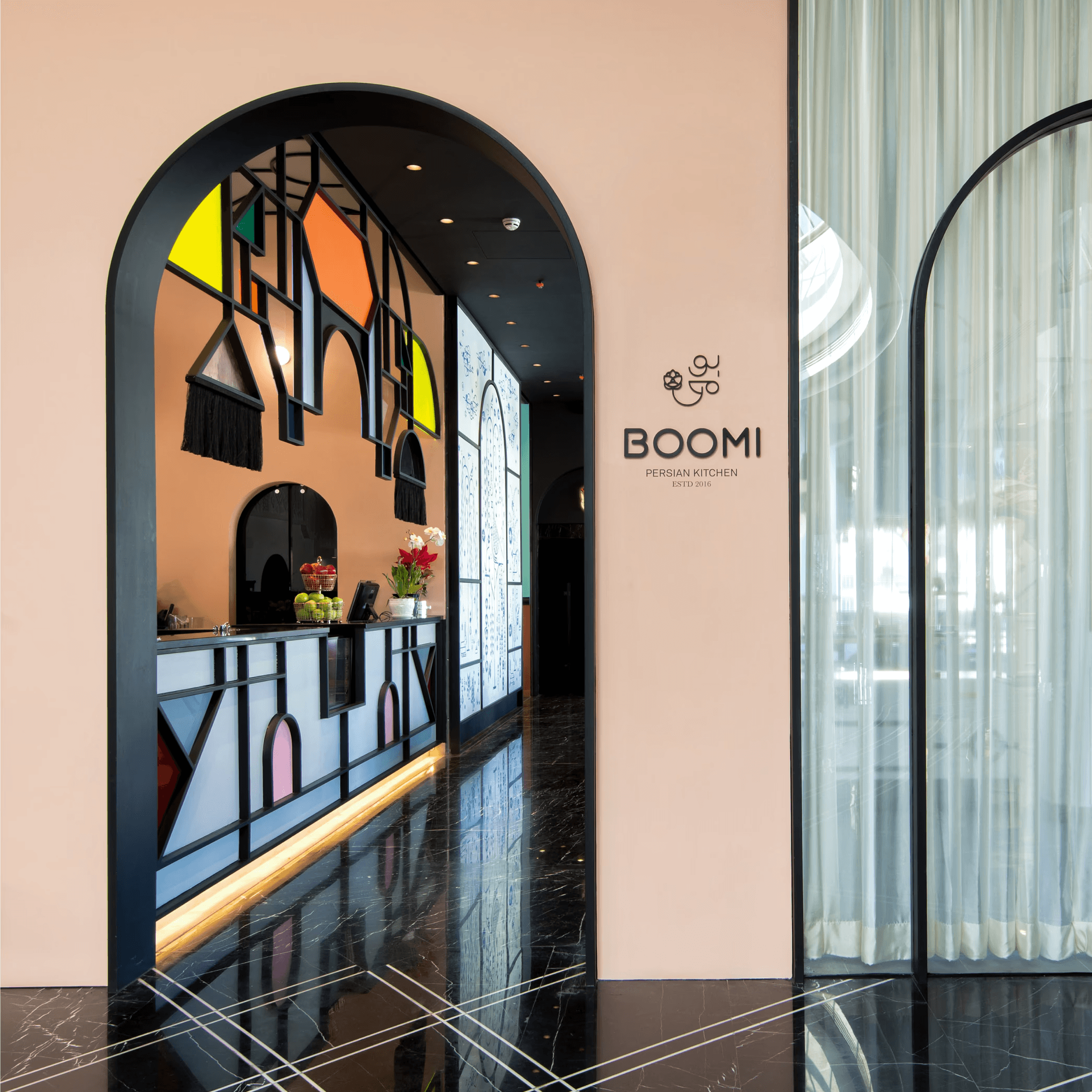
The visual identity was meticulously crafted to harmonize with the restaurant’s ambiance and the concept of culinary fusion between Eastern and Western traditions. Its objective is to engender a seamless and pleasurable experience, wherein the visual identity seamlessly integrates with the architectural design and the exceptional cuisine.

The visual identity was meticulously crafted to harmonize with the restaurant’s ambiance and the concept of culinary fusion between Eastern and Western traditions. Its objective is to engender a seamless and pleasurable experience, wherein the visual identity seamlessly integrates with the architectural design and the exceptional cuisine.