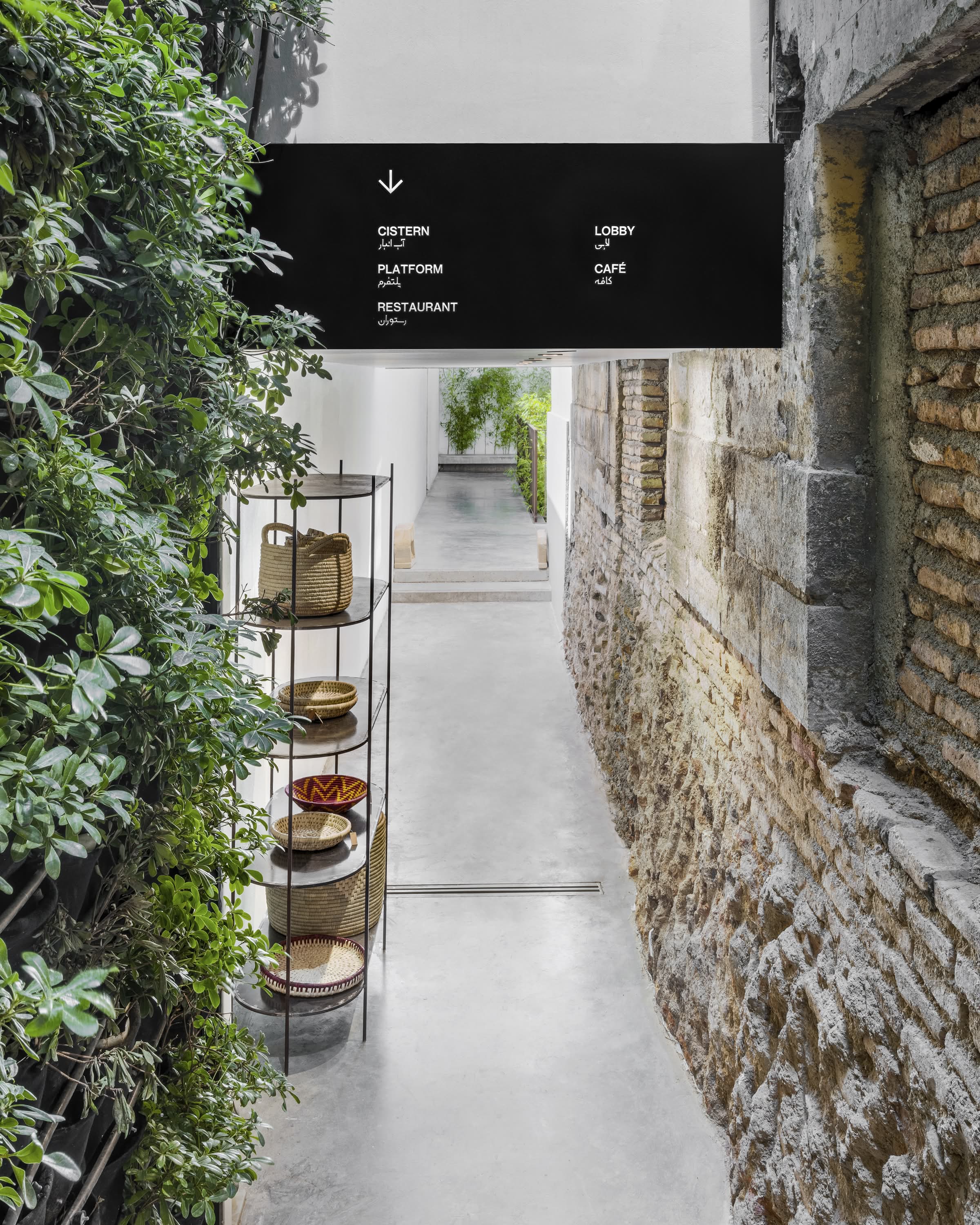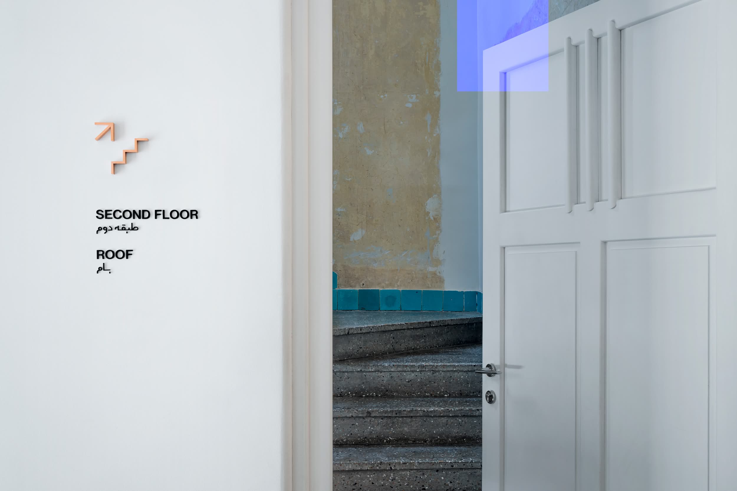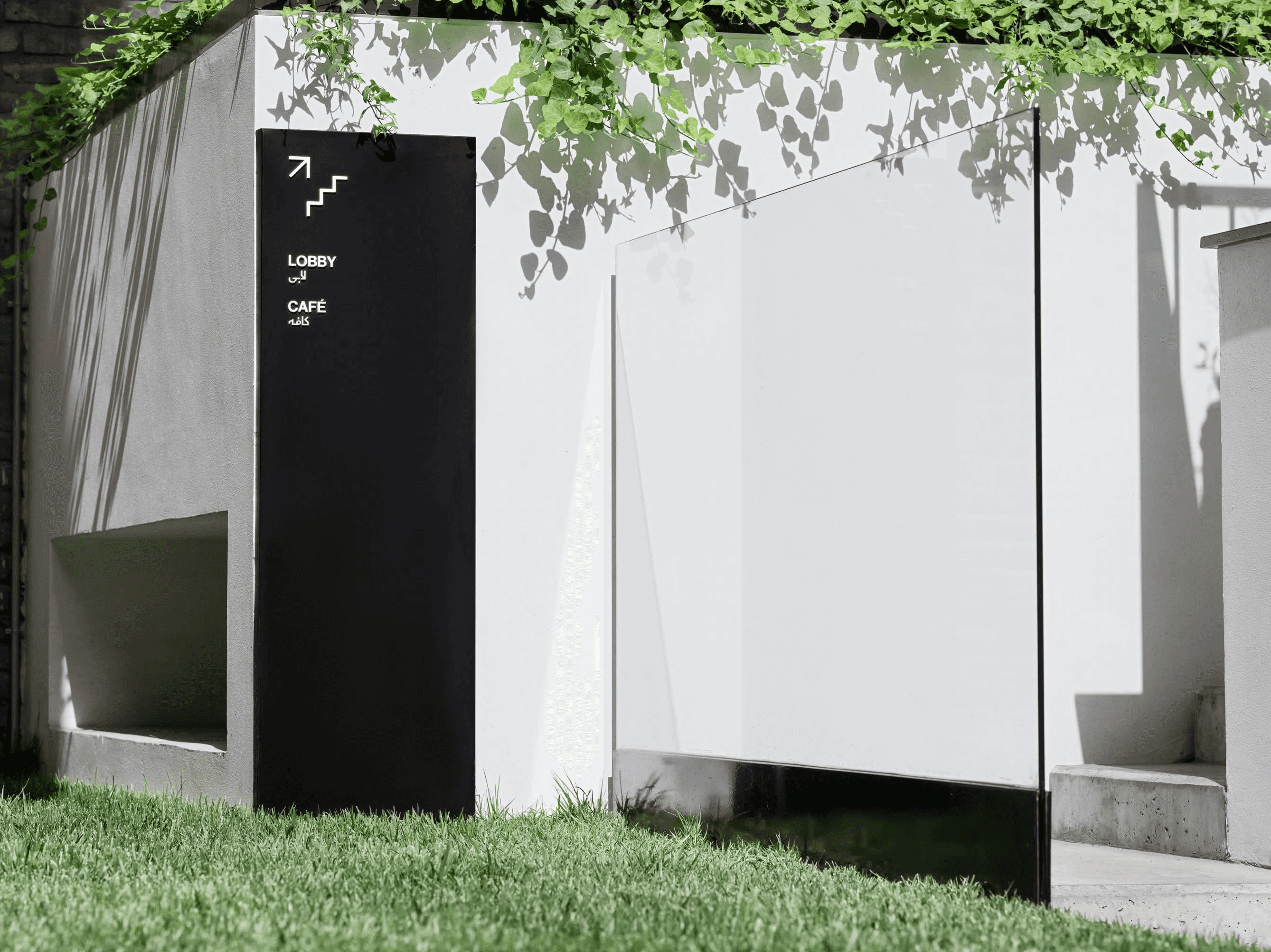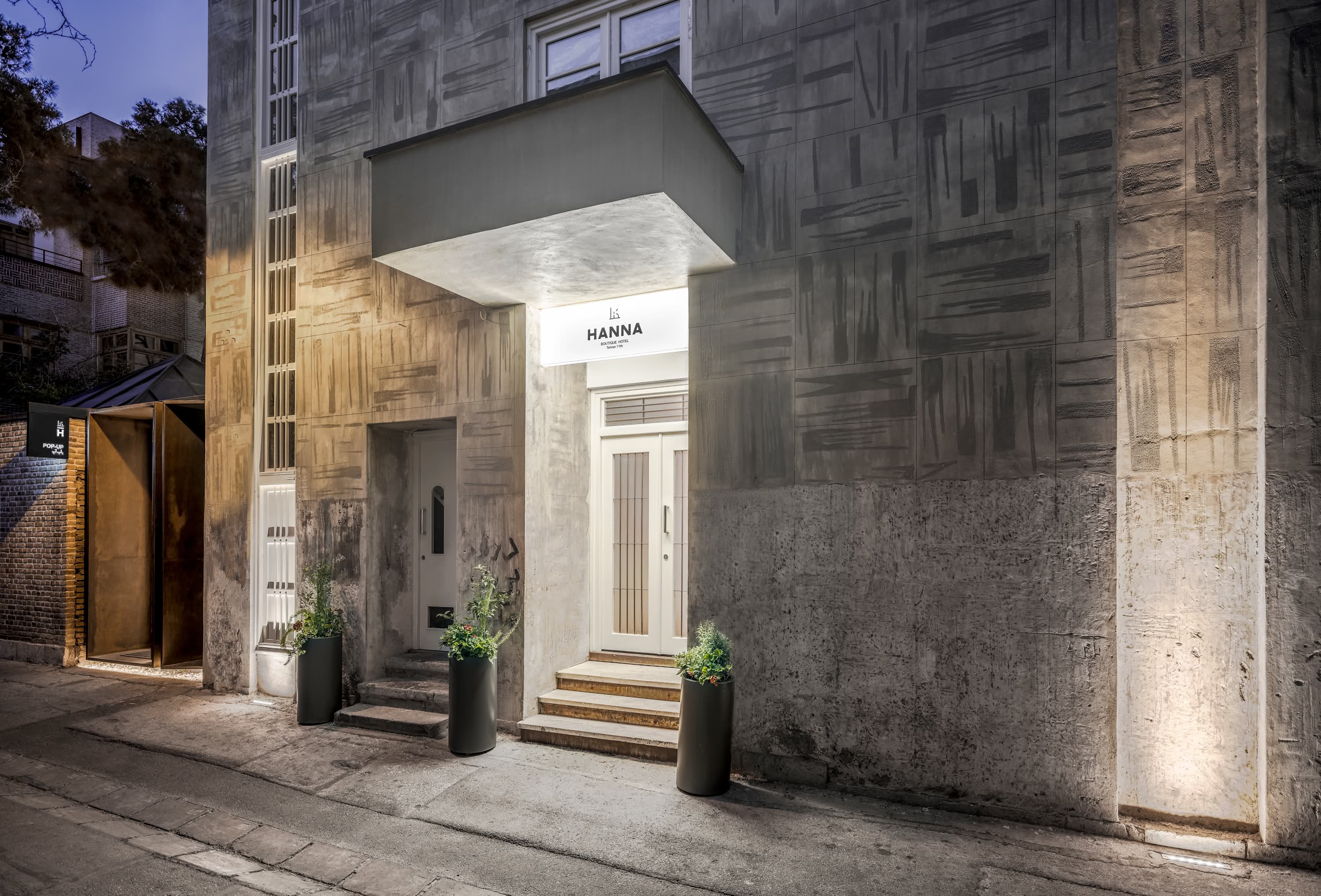
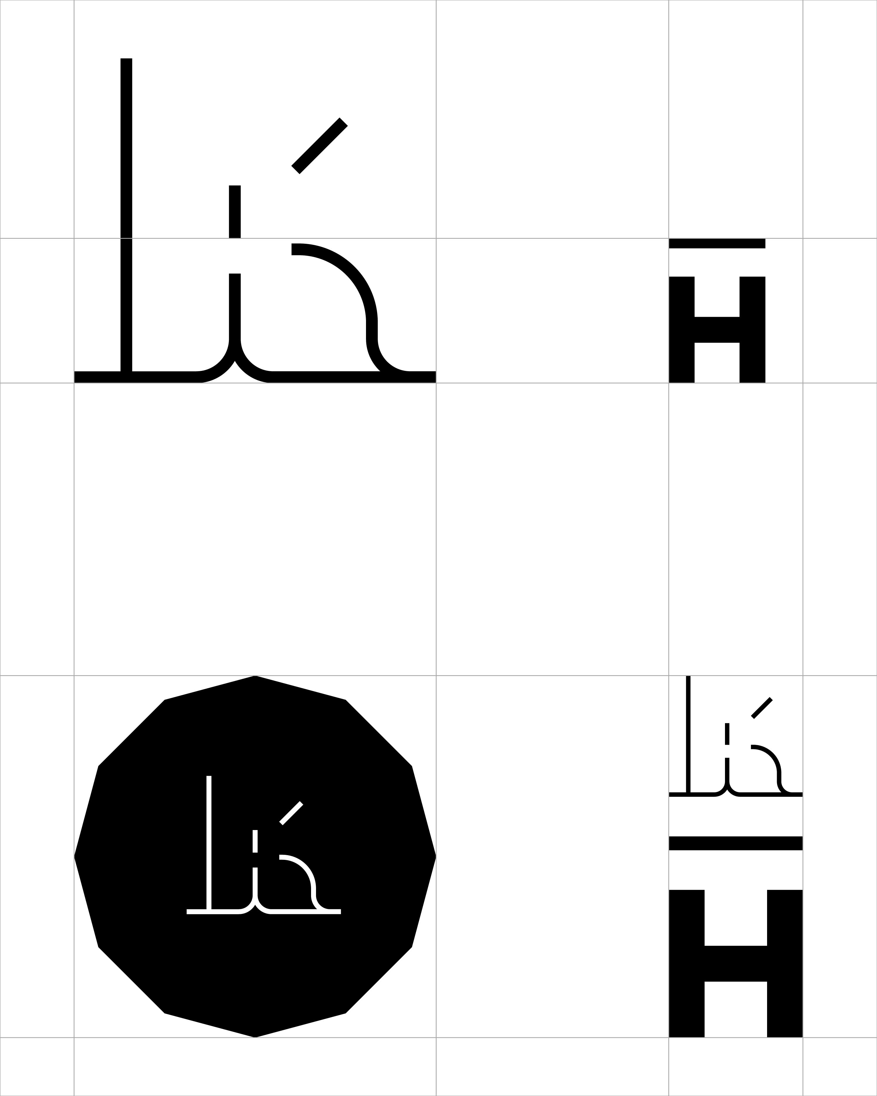
The identity of Hanna embraces the soul of the building with its graphic façade pattern. To compliment the architectural bold character the English typeface is composed out of a grotesque logotype paired with a filigree Farsi mono-line logotype representing the fineness of the boutique hotel itself. The layouts are held very classy with centre alignments.


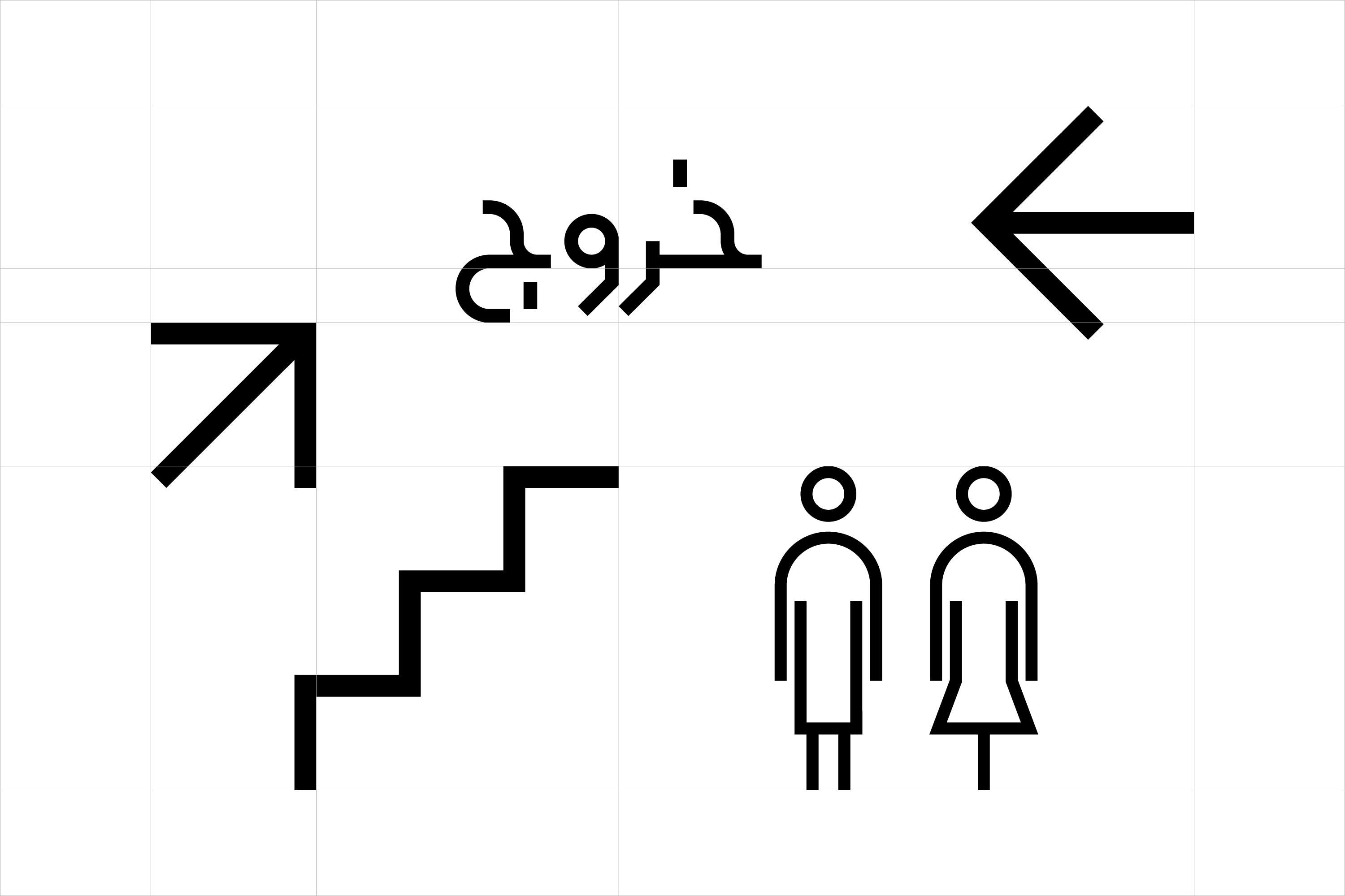




A cohesive color scheme of deep blue, intense green combined with fresh turquoise and pastel pink pays homage to the historical aesthetic of the architecture. Hanna’s branding is found across its logotype, animations, stationery, signage & way-finding systems for public and private spaces, brochures, website and menus.




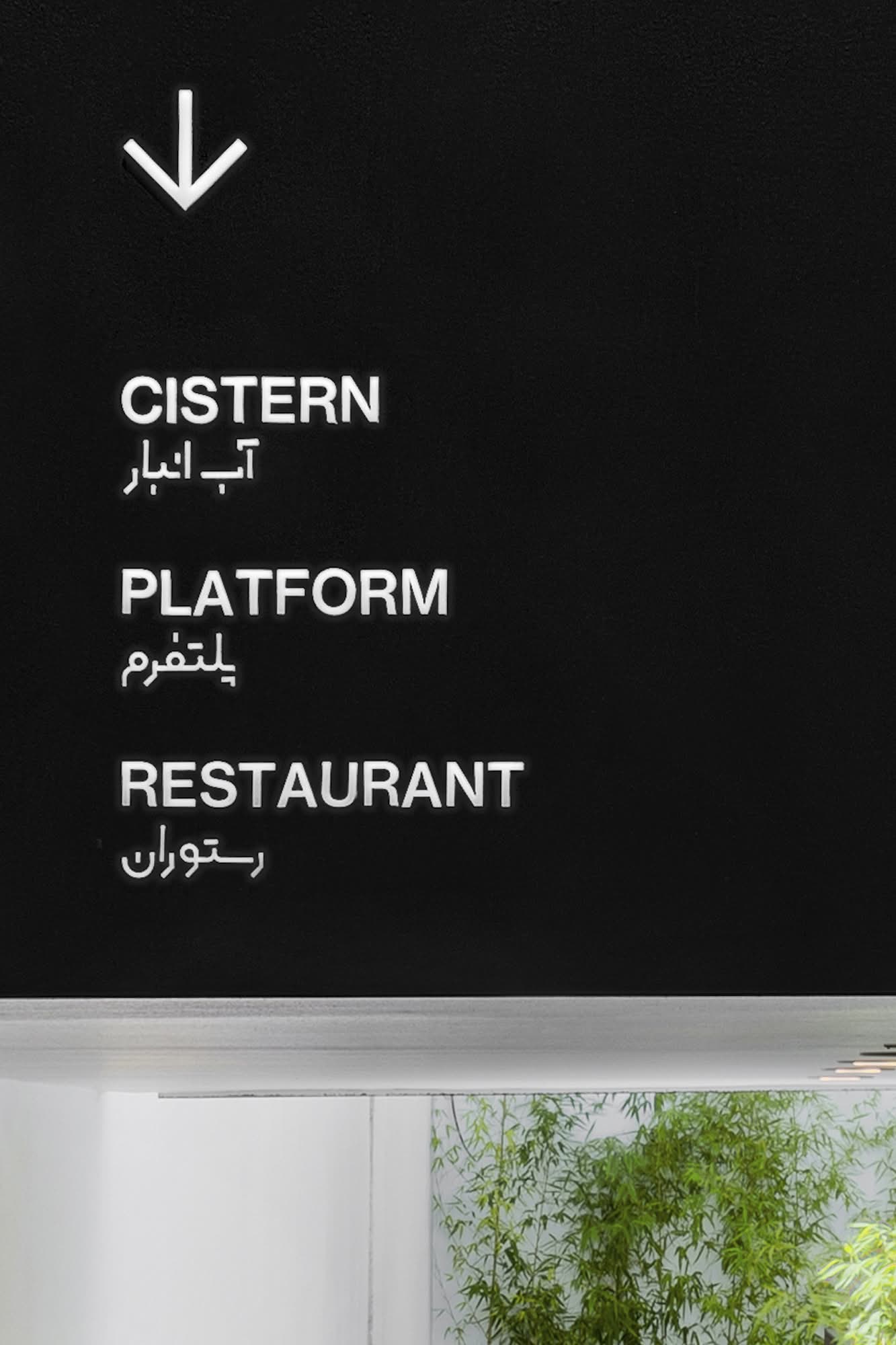
A cohesive color scheme of deep blue, intense green combined with fresh turquoise and pastel pink pays homage to the historical aesthetic of the architecture. Hanna’s branding is found across its logotype, animations, stationery, signage & way-finding systems for public and private spaces, brochures, website and menus.